
How to Mix Patterns and Textures for a Stylish Interior
Mixing patterns and textures makes rooms feel layered and personal, but it can tip into chaos. The rules are simple: share a color palette, vary pattern scale and balance busy areas with calm ones. Here is how to combine prints and textures with confidence.
Table of Contents
Key Takeaways:
- Choose a color palette: Pick three to five colors and repeat them across every pattern and texture so the mix reads as one room.
- Vary the scale: Pair one large pattern with a medium and a small one so the prints don’t fight for attention.
- Incorporate solids: Give busy prints breathing room with solid walls, upholstery or rugs.
- Experiment with different textures: Combine fabric, wood, metal, glass and stone so the room feels layered, even in a single color.
- Consider the space: Match the amount of pattern to the room’s size and use, and go lighter in small or busy rooms.
The Art of Balancing Colors and Patterns
Start with one dominant color that anchors the room, usually on the walls, the sofa or a large rug. Then bring in two to four supporting colors through your patterns. A palette of three to five hues gives you enough variety to mix prints without the room feeling noisy. A simple way to stay in control is to use patterns from the same color family, such as a navy stripe, a blue-and-white floral and a pale blue check, so they read as related even though the motifs differ.
A useful starting split is the 60-30-10 rule: about 60% of the room in your main color, 30% in a secondary color and 10% in an accent. Your largest pattern usually carries the main or secondary color, while small prints on pillows or a lampshade can bring in the accent. If a print contains a color that appears nowhere else in the room, repeat that color once or twice elsewhere, or choose a different print.
Color Theory Essentials for Pattern Mixing
A little color theory goes a long way when you mix patterns. Complementary colors sit opposite each other on the color wheel, like blue and orange or green and red, and give you strong, lively contrast. Analogous colors sit next to each other, like blue, blue-green and green, and give a calmer, more relaxed look. Pick one approach per room. Complementary pairs suit a playful living room, while analogous schemes work well in bedrooms where you want the eye to rest.
Harmonizing Patterns: Scale and Contrast
Scale is what keeps a pattern mix from turning into visual noise. If every print is the same size, they compete. Instead, aim for one large, eye-catching pattern, one medium pattern and one or more small ones. The large print sets the tone, the medium one supports it, and the small prints read almost like texture from across the room. Repeating this three-level structure throughout the space gives your mix a clear order.
For example, a large floral on the curtains can sit next to small geometric prints on throw pillows without either one looking busy. Think of it as a hierarchy: large patterns claim attention, and smaller patterns fill in around them. Mixing pattern types helps too. Pair an organic motif like a floral or paisley with a structured one like a stripe or check, so the shapes contrast while the colors tie them together. The result feels layered and intentional rather than flat.
Layering Textures for Depth and Interest
Texture adds depth even in a room with very little pattern. Layer different materials, such as soft linen, plush velvet and woven rattan, so the surfaces catch light in different ways. A chunky knit throw on a smooth leather sofa is a classic pairing because the contrast is easy to see and feel. Wood, stone and ceramics bring in natural texture as well. Watch the balance: if one texture covers most surfaces, like velvet on every seat, the room can feel heavy, so mix rough with smooth and matte with shiny.
Choosing Complementary Textiles
Choose textiles that work together in both color and feel. Cotton, silk and jute look very different, but they combine well when they share warm or cool undertones. Soft gray upholstery with warm cream cushions, for example, feels polished without looking cold. Before you buy, gather swatches and lay them together on the sofa or bed in daylight, then again under your evening lighting. Colors can shift a lot between the two, and it is much cheaper to find a clash with a swatch than with a full set of curtains.
Creating Visual Cohesion Through Texture
Visual cohesion keeps a mix of textures from feeling random. One easy method is to repeat a family of textures. A rough-hewn wooden coffee table, a jute rug and linen curtains all have an organic, slightly irregular surface, so they tie the room together without matching exactly. Using several patterns within one color scheme works the same way. The repetition gives the eye something to follow, and the room looks planned rather than chaotic.
Think about how textures move around the room. If your sofa is velvet, add a velvet pillow on a nearby chair and a contrasting cotton or linen pillow on the sofa itself. The repeat links the two pieces, and the contrast keeps it interesting. Apply the same idea to wood tones, metals and finishes by repeating each one two or three times across the room. A single brass lamp can look out of place, while brass on a lamp, a frame and a drawer pull looks deliberate.
Creating Focal Points with Bold Patterns
A bold pattern gives the room a clear focal point. A strongly patterned area rug or a large piece of art draws the eye first, and it can also guide your color choices for everything around it. Pull two or three colors from that piece and repeat them in pillows, throws or accessories. Placed well, a bold pattern anchors a seating group and makes the rest of the room easier to plan.
Selecting Statement Pieces
Choose statement pieces that suit your taste and the way you use the room. A geometric-patterned sofa, a richly patterned throw or a wallpapered accent wall can all serve as the main feature. Pick one per room, or one per zone in an open plan, and keep the surrounding pieces quieter. A patterned sofa looks best with solid or lightly textured chairs, and a wallpapered wall usually needs plain curtains nearby. The aim is a clear focal point, not a contest.
Strategically Placing Patterns for Maximum Impact
Where you place a bold pattern matters as much as which one you pick. Larger patterns tend to work best at eye level or on big surfaces, such as a feature wall, curtains or a headboard, where they read clearly. Smaller patterns fit closer to the floor or on accessories, where they support the main print without fighting it. This arrangement keeps the room balanced and guides the eye smoothly from one area to the next.
Think about how people move through the room. A striking patterned sofa stands out best against a plain, neutral wall, with accessories that repeat a color from its pattern. You can also repeat the same motif in different sizes, such as a large floral on the curtains and a small floral on cushions or a framed print. That repetition creates unity and keeps attention on the focal point. Also check the view from the doorway: the first pattern you see when you walk in should be the one you want people to notice.
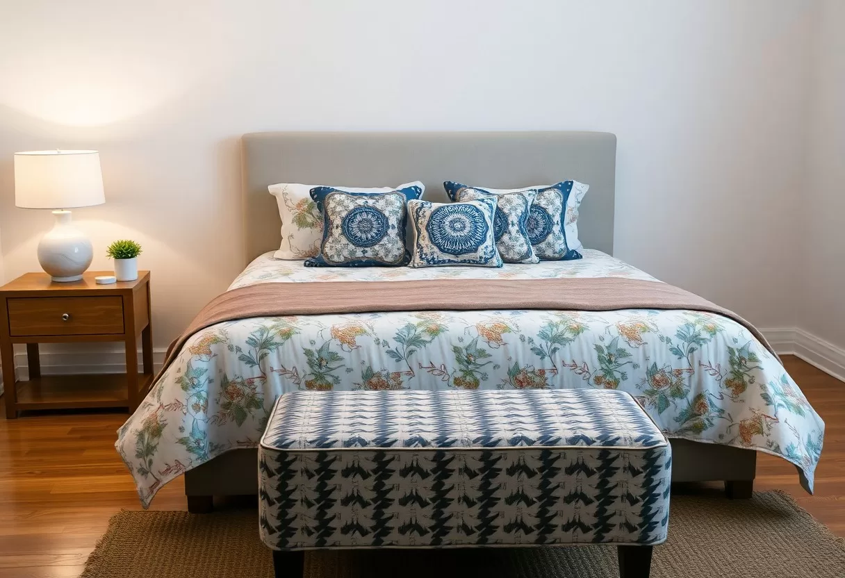
Avoiding Common Pitfalls in Pattern Mixing
Pattern mixing goes wrong in a few predictable ways, and knowing them makes them easy to avoid. The most common mistake is putting several busy patterns right next to each other, such as a printed chair on a printed rug in front of patterned wallpaper. Give each bold print some space, usually with a solid piece in between. Less is often more here. Keep an eye on scale and color so the space doesn’t feel disjointed or cluttered.
Other common slips include buying every patterned piece at once, which makes the mix hard to judge, and forgetting that the floor and walls are part of the palette too. Another is relying only on pattern and skipping texture, which can make a room look flat in person and in photos. Build the room in layers, live with it for a week or two, and then add or remove pieces.
Overmatching vs. Thoughtful Clashing
Matching everything too closely can make a room feel stiff, like a showroom set. Try thoughtful clashing instead, where contrasting patterns and colors work together because they share at least one link, such as a common color or a similar line weight. Pairing a large geometric print with a delicate floral, for example, adds energy as long as both include the same blue or green.
Maintaining a Cohesive Style Narrative
A cohesive style narrative means the room tells one story. The patterns and textures can vary, but they should all point to a common theme or style. If your taste leans bohemian, choose richly colored, eclectic textiles such as kilim, suzani or block prints, and make sure they share similar tones or motifs. For a coastal look, stripes, linen and woven textures in blues and sandy neutrals all belong to the same story.
Decide how you want the room to feel before you choose pieces. For a relaxed, welcoming space, lean on soft textures and earthy colors such as terracotta, olive and warm beige. Folk-inspired or tribal prints sit well alongside muted, natural tones, as long as each piece supports the mood. For a calmer bedroom, reduce contrast and keep patterns small. Guests should be able to move through the room without feeling overwhelmed by competing visuals.
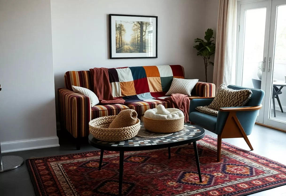
Transformative Techniques for Small Spaces
Small rooms can feel cramped, but a few smart choices make them feel open and stylish. Focus on light colors, multifunctional furniture and a restrained amount of pattern. In a small space, one medium pattern plus plenty of texture often works better than three busy prints. Lighter backgrounds help the room feel larger, and vertical stripes on curtains or wallpaper can make the ceiling seem higher. You can still show your style; you just need to edit more carefully.
Utilizing Mirrors and Lighting
Mirrors change how big a room feels by bouncing light around and adding depth. Placing a mirror across from or beside a window spreads daylight further into the room. Lighting matters too. Warm white bulbs around 2700 K make a small space feel cozy, and layering ceiling, wall and table lamps avoids dark corners. Wall sconces and pendant lights give you ambient light without using up floor or table space.
Opting for Multi-functional Decorative Elements
Multi-functional pieces are essential in a small space. Ottomans with storage inside, coffee tables that lift or extend for dining, and benches with drawers all save room without sacrificing style. Decorative baskets on open shelves hide clutter while adding woven texture. Each piece can also carry part of your pattern and texture plan, such as a patterned ottoman or a rattan basket, so the room stays organized and interesting.
Pieces that do two jobs make a small room more practical and better looking. A sleek sofa bed gives you a place to lounge and a spot for overnight guests, and a ladder shelf can hold books and art plus baskets of blankets. Look for items that add visual interest, function and flexibility at the same time. Keep main walkways around 30 to 36 inches wide where you can, so the room still feels easy to move through. Combining style with practicality is the key to living well in a small space.
60-30-10 color palette generator
Pick a color you love and get a balanced room palette using the designers’ 60-30-10 rule.
Conclusion
With these ideas, you can mix patterns and textures with confidence. Start with a consistent color palette, vary the scale of your prints and balance them with solids. Layer textiles like rugs, throws and pillows to bring in different materials without overcrowding the room. Try new combinations in a small area first, such as a reading corner or a bed, before you commit to bigger pieces. Mixing patterns and textures well is mostly about repetition and restraint, and the result is a room that looks personal and put together.
FAQ
Q: What are the basic tips for mixing patterns and textures in interior design?
A: When mixing patterns and textures, start with a cohesive color palette to ensure harmony. Use a variety of scales; mix large patterns with smaller ones to create balance. Incorporate different materials, such as wood, metal, and fabric, to add depth. Layer textures by combining smooth with rough surfaces, such as silk cushions on a chunky knit throw. Lastly, ensure there is some commonality between the patterns, whether it’s a color, theme or texture, to tie the room together.
Q: How do I choose patterns that complement each other?
A: To choose complementary patterns, consider the overall theme of your space. For instance, if you have a modern aesthetic, opt for geometric patterns alongside abstract designs. Use a mix of florals and stripes for a more traditional or eclectic look. Pay attention to the color scheme; patterns should share at least one consistent color to coordinate effectively. Playing with contrasting styles can also create interest, such as mixing vintage florals with contemporary graphics.
Q: What role does scale play in mixing patterns?
A: Scale is important in pattern mixing as it adds visual interest and balance to a space. Aim to pair different sized patterns for contrast; for example, a large-scale floral wallpaper can be complemented by a small, subtle polka dot fabric for cushions. This approach prevents the space from feeling chaotic and helps each pattern to shine individually. Think of scale as a way to direct the viewer’s eye through the room, leading them naturally from one element to another.
Q: How can I incorporate textures without overwhelming my space?
A: To incorporate textures without creating a cluttered look, start with a base of neutral colors and simple textures on larger furniture pieces. Introduce diverse textures through smaller decor items, such as throws, pillows, or decorative objects. Sticking to a few layered textures can create more impact—experiment with a mix of smooth velvet, rustic wood, and soft knitted fabrics. Use textiles as a way to soften hard surfaces, ensuring that the overall design feels inviting rather than overwhelming.
Q: Are there specific patterns or textures that work well together?
A: Yes, certain patterns and textures naturally complement each other. For example, stripes work beautifully with florals, adding a classic touch to the decor. Animal prints can be paired with solids or geometric patterns to create a dynamic environment. In textures, pairing soft textiles (like cotton and linen) with harder materials (like metal and glass) creates visual contrast, making the space feel layered and sophisticated. Always aim for a unified feel by selecting elements that resonate with your intended mood or theme.
Test pattern combinations on a photo of your room with the free AI interior design generator.
Related Guides
