
Choosing the Perfect Color Palette for Your Living Room
The right living room color palette sets the mood for the room you use most. Color psychology, a simple 60-30-10 rule and testing samples in your own light make the choice much easier. Here is a step-by-step way to pick colors that feel right day and night.
Table of Contents
Key Takeaways:
- Decide on the mood first: warm tones feel cozy, while cool tones feel calm and restful.
- Use a color wheel to find complementary and analogous colors that work well together.
- Start with a neutral base so bold accent colors are easy to change later.
- Test large paint samples on several walls, because daylight and lamps change how a color looks.
- Add colors you personally love so the room feels like yours, not a showroom.
The Psychological Impact of Color Choices
Color does more to set the mood of a living room than almost any other choice you make. The same sofa and rug can feel calm and restful in one shade or lively and social in another. Once you know how people tend to react to different hues, it gets much easier to pick a palette that fits your personality and the way you actually use the room, from quiet reading to hosting friends.
How Colors Influence Mood and Behavior
Most people link certain colors with certain feelings. Blue usually reads as calm and restful, which suits a room where you unwind at night, while yellow feels cheerful and sunny. Green brings a sense of balance and pairs easily with wood and plants, and red adds warmth and energy, so it works best in small doses, such as an accent chair or a rug. Think about what you do most in the room and let that guide the main color.
The Science Behind Color Psychology
Color psychology looks at how colors affect the way we feel and behave. Reactions are partly personal and cultural, so treat it as a guide, not a rulebook. Still, some patterns are common: the warmth of orange tends to feel friendly and creative, while cool tones such as blue-gray and sage feel steady and quiet. Notice how you react to a color in rooms you’ve visited, then compare that feeling with the mood you want at home.
Warm, saturated colors like red are often described as stimulating, while soft pastels and muted shades tend to feel restful. That’s one reason red shows up so often in dining rooms and soft blue or green in bedrooms. For a living room, match the intensity to your habits. If it’s a busy family room, a few strong colors keep it lively. If it’s where you relax after work, choose softer, grayed-down versions of the colors you love.
Decoding Color Theory for Interior Design
A little color theory goes a long way. You don’t need art school, just a basic sense of how colors relate to each other on the color wheel. Once you know which pairs contrast and which ones blend, you can build a palette that looks planned rather than random, and you’ll make fewer costly mistakes with paint and fabric.
Primary, Secondary, and Complementary Colors
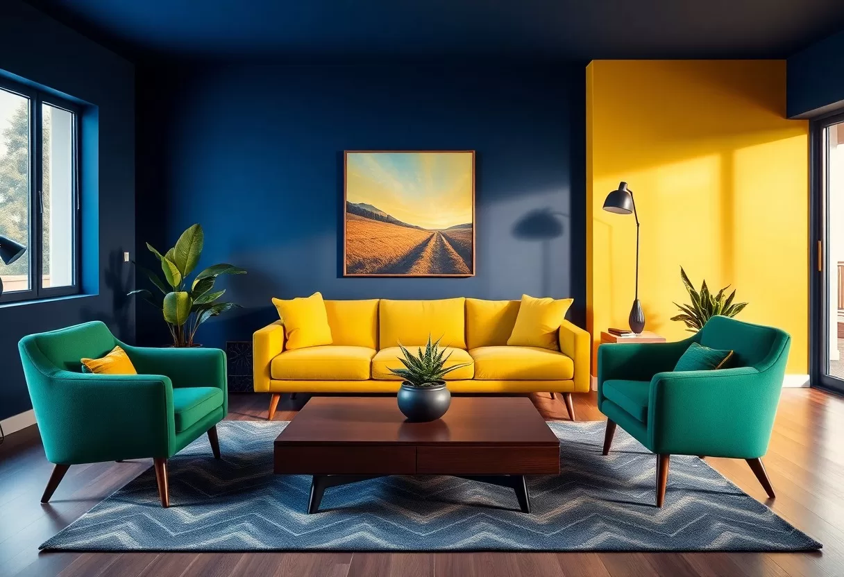
Every color starts with the primaries: red, blue and yellow. Mix two of them and you get the secondaries: green, orange and purple. Complementary colors sit opposite each other on the wheel, such as blue and orange or red and green, and they make each other look brighter. Analogous colors sit side by side, like blue, blue-green and green, and they create a calmer, blended look. For a living room, an analogous base with one complementary accent is an easy, reliable formula.
The Role of Warm and Cool Tones
Warm tones like red, orange and yellow make a room feel cozy and lively, and they can make a large room feel more intimate. Cool tones such as blue, green and violet feel calm and make walls seem to recede, so a small room feels a bit larger. Mixing the two adds depth. For example, a cool gray-blue base with warm wood furniture, brass lamps and rust-colored pillows feels relaxed but never cold.
Pay attention to undertones as well as the main color. Many grays and beiges lean slightly pink, green, yellow or blue, and those hints show up once the paint is on the wall. A mostly cool palette can feel sterile without some warmth, so add it through textiles, wood or art. A plain gray living room comes to life with mustard cushions or a bold red print over the sofa. Aim for a mix that feels lively but still looks intentional.
Balancing Boldness and Subtlety
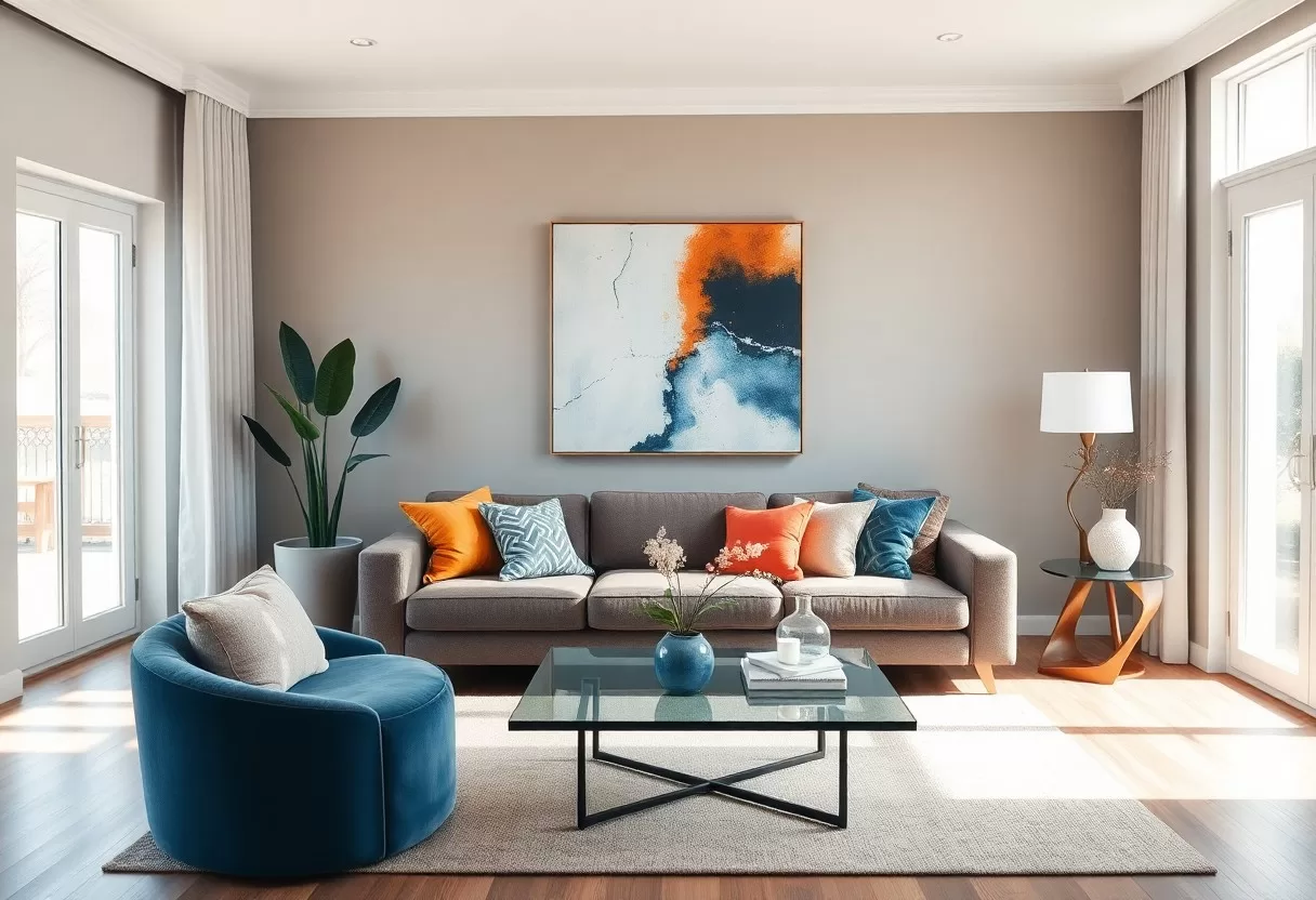
Getting the balance between bold and quiet colors right keeps a living room from feeling flat or chaotic. The 60-30-10 rule is a simple guide: about 60% of the room in a main color (usually the walls), 30% in a secondary color (sofa, curtains, rug) and 10% in accents (pillows, art, decor). A deep blue sofa against soft beige walls, for example, gives the room energy without overwhelming it, and it stays comfortable for both relaxing and having people over.
Making a Statement with Accent Colors
Accent colors work like punctuation in your design. They add personality without taking over. Throw pillows, artwork, a lamp or a colorful vase can wake up a neutral room and draw the eye to a reading corner or the fireplace. Rich emerald or warm coral are good choices because they look strong next to cream and gray. Repeat each accent two or three times around the room so it looks deliberate rather than random.
Creating Harmony through Neutrals
Neutrals give your bolder choices somewhere to rest. Beige, gray, greige and taupe help one area of the room flow into the next and tie mismatched furniture together. With a mostly neutral base you can try daring accent colors without the room feeling busy, and you can swap pillows, throws and art when your taste changes, without repainting. That flexibility is a big plus if you rent or like to refresh your decor every few years.
Neutrals also suit almost any style. Soft cream walls let antique wood furniture stand out, while a warm gray sets off modern metal and glass accessories. Texture keeps a neutral room from looking flat, so layer different materials, like a chunky knit throw on a leather sofa, a jute rug and linen curtains. When the colors are quiet, texture does the work that color would otherwise do, and the room stays stylish for years.
Practical Steps to Select Your Palette
Picking your palette is easier when you follow a few practical steps. Start with something you already own and love, such as a rug, a sofa or a piece of art, and pull your main color from it. Then add a secondary shade and one or two accents. Choose a mix of textures and finishes to give the colors depth. Finally, test paint samples on your walls and look at them in morning, afternoon and evening light before you commit.
Assessing Your Space: Lighting and Size
Your room’s size and light change how colors look. In smaller rooms, light colors with a high light reflectance value (LRV) bounce light around and make the space feel more open, while large rooms can handle deeper shades without feeling closed in. Direction matters too. North-facing rooms get cooler, bluish light, so warm colors balance them. South-facing rooms get warm light most of the day, which flatters cooler shades. Watch how sunlight moves through the room over a full day.
Gathering Inspiration: From Nature to Fashion
Inspiration for your living room color palette can come from almost anywhere, especially nature and fashion. Look at the colors of a favorite place, like a forest, a beach or a desert, and notice which combinations make you feel good. Fashion is another rich source, since designers often pair colors in surprising ways. Check the clothes you wear most, your favorite fabrics or a scarf you love. Those colors tend to be ones you’ll enjoy living with.
Nature is good at color pairing, from the deep greens of a forest to the warm oranges of a sunset. It also shows you proportion: lots of a calm base color, like sky or sand, with small bursts of brighter color, like flowers. Fashion moves fast, with earthy tones each fall and soft pastels each spring, so borrow ideas but don’t chase every trend on your walls. As you collect images and swatches, pin them to a mood board. It lets you see the whole palette at once and makes narrowing down your choices much easier.
Real-World Applications: Case Studies of Stunning Living Rooms
Looking at a few typical living room schemes shows how different palettes change a space. Each example below is a common approach you can adapt to your own room, taste and budget.
- Example 1: A monochromatic scheme in several shades of blue suits a bright city apartment, keeping the room calm and letting natural light take center stage.
- Example 2: Earth tones like terracotta and olive green give a cottage or bungalow a warm, welcoming feel.
- Example 3: A minimalist apartment can use bright accent colors against a neutral backdrop for an energetic but uncluttered look.
Transformative Color Schemes
Bold color schemes can completely change how a living room feels. Pairing soft pastels with one deep, contrasting shade, such as blush with charcoal or pale sage with navy, adds visual interest while keeping the room calm. Another option is color drenching, where walls, trim and sometimes the ceiling are painted in the same color or close shades. It makes a room feel cozy and enveloping and works well in small spaces with little architectural detail.
Lessons from Design Experts
Designers often recommend starting with a neutral base to anchor the space, then layering in color through accessories, textiles and art. This approach adds depth and keeps the room easy to update when trends or your tastes change. It also saves money, since swapping pillows and a throw costs far less than repainting a whole room.
Designers also point out that warm and cool colors change how big a room feels. Warm colors like red or terracotta on one wall make that wall seem closer and the room more intimate, while cool shades seem to recede and open the space up. Test paint samples in different lighting: under your lamps at night as well as in daylight at different times. Bulbs matter too. Warm white bulbs around 2700 K flatter warm palettes, while cooler bulbs can make beige look gray or dull.
Summing up
Choosing a living room color palette comes down to your personal style, the mood you want and the light in the room. Use color psychology as a guide, build a balanced scheme with a main color, a secondary color and a few accents, and test everything on your own walls. Take your time with samples and trust your instincts. The result will be a room that looks good, feels welcoming and works for you and your guests.
60-30-10 color palette generator
Pick a color you love and get a balanced room palette using the designers’ 60-30-10 rule.
FAQ
Q: What are the key factors to consider when choosing a color palette for my living room?
A: When selecting a color palette, consider the room’s size, natural light, and existing furnishings. The size can determine whether lighter or darker colors will create an inviting atmosphere. Take note of the natural light throughout the day, as it can affect how colors appear at different times. Lastly, look at your existing furniture and decor to ensure your color choices complement these elements effectively.
Q: How many colors should I include in my living room palette?
A: A good rule of thumb is to use three to five colors. Start with a dominant color for large areas like walls, followed by a secondary color that can be used for larger furnishings or textiles. Accent colors can then be introduced through artwork, cushions, and smaller decorative items. This approach allows for a harmonious look while keeping the design visually interesting.
Q: Are there specific color combinations that work best in living rooms?
A: Yes, some popular combinations include neutral tones paired with bold accents, such as a warm beige with teal or mustard. Alternatively, you can opt for a monochromatic scheme, like various shades of blue or gray. Earthy tones, such as greens and browns, work well for a cozy, inviting atmosphere. Ultimately, match the colors with your personal style and the overall mood you aim to create.
Q: How can I test colors before committing to a palette for my living room?
A: Testing colors in your space is necessary before making a final decision. Purchase sample pots of your chosen colors and apply them to your walls. Observing how they look at different times of day can be very helpful. It’s also beneficial to view the colors with your existing furniture and decor for a true representation of how they will work together.
Q: How do I ensure my living room reflects my personal style through the color palette?
A: To reflect your style, start by gathering inspiration from sources like magazines, websites, and social media platforms. Identify colors, patterns, and styles that attract you. Consider incorporating those elements into your palette. Additionally, personal touches through artwork, cushions, and throws that resonate with your tastes can help personalize the space further and make it uniquely yours.
Try palettes on a photo of your living room with the free AI interior design generator.
Related Guides
