
Color Drenching – A Bold Interior Design Move That’s Taking Over
Over the past few seasons, color drenching has become one of the boldest moves in interior design. You paint the walls, ceiling, trim and sometimes even doors and built-ins in a single shade or close tones of one color. The result is a calm, wrap-around look that shows off your personality. It can make a room feel cozy and finished with nothing but paint, and it is easier to pull off than it sounds, which makes it a smart way to redefine your interiors.
Table of Contents
Key Takeaways:
- Color drenching means painting walls, ceilings and trim in the same color for a cohesive, wrap-around look.
- The look is popular because it feels personal and makes a strong statement with paint alone.
- Deep tones make a room feel cozy, while lighter shades blur edges and can make it feel larger.
Understanding Color Drenching
To get the most from color drenching, it helps to understand what it really involves. Instead of a white ceiling and contrasting trim, one color wraps the whole room: walls, ceiling, baseboards, window frames and doors. Without hard lines between surfaces, your eye moves around the room smoothly. Done well, a drenched room feels cozy and complete, not closed in.
Definition and Concept
In practice, you paint an entire room in one color, including ceilings and moldings. Some people go further and paint radiators, built-in shelves and even furniture to match. The result is an intensely cohesive environment. A deep blue study can feel calm and focused, while a warm terracotta living room feels lively and welcoming.
Historical Context
The idea is not entirely new. Painters and designers have long used strong, single colors to give rooms a clear identity. In the early 20th century, the Bauhaus school treated color as a working part of design rather than decoration, and its teachers explored how color changes the way we see space.
Wassily Kandinsky, who taught at the Bauhaus in the 1920s, wrote about how colors carry emotional weight. Later, the bold palettes of mid-century modern homes showed how strong color could set a room’s mood. Older historic houses also often painted paneling and trim in one shade. Designers revived the full-room approach in the 2020s, as more homeowners moved away from all-white rooms toward something warmer and more personal.
Benefits of Color Drenching
Painting a room in one color has real benefits. With no contrasting trim, edges blur, so a small room can feel less boxy and a big room can feel cozier. It also hides awkward features like odd ceiling angles, radiators or mismatched doors. And it is one of the cheapest ways to make a bold statement, since you only need paint. For a deeper look, read What’s the Big Deal with Color Drenching?.
Psychological Impact
Color affects how a room feels. Warm hues like terracotta, rust and ochre tend to feel cozy and social, while cool blues and greens usually feel calm and restful. Because a drenched room surrounds you with one color, that effect is stronger than with a single accent wall. Choose the color for how you want to feel in the room, not just for how it looks in a photo.
Match the color to the room’s job. A bedroom often works best in a soft, muted shade like sage, dusty blue or warm taupe. A dining room or reading nook can handle deeper tones like oxblood, navy or forest green, since you use it mostly in the evening. For a home office, mid-tone greens and blues are easy on the eyes for long hours. Very bright, saturated colors can feel tiring on every surface, so save them for small spaces.
Aesthetic Appeal
The visual impact is hard to miss. Wrapping a room in one hue gives it a finished, intentional look, and furniture from different eras or styles suddenly seems to belong together. Art and wood pieces stand out against the solid backdrop, almost like objects in a gallery. It is a good fix for a room that feels busy or cluttered.
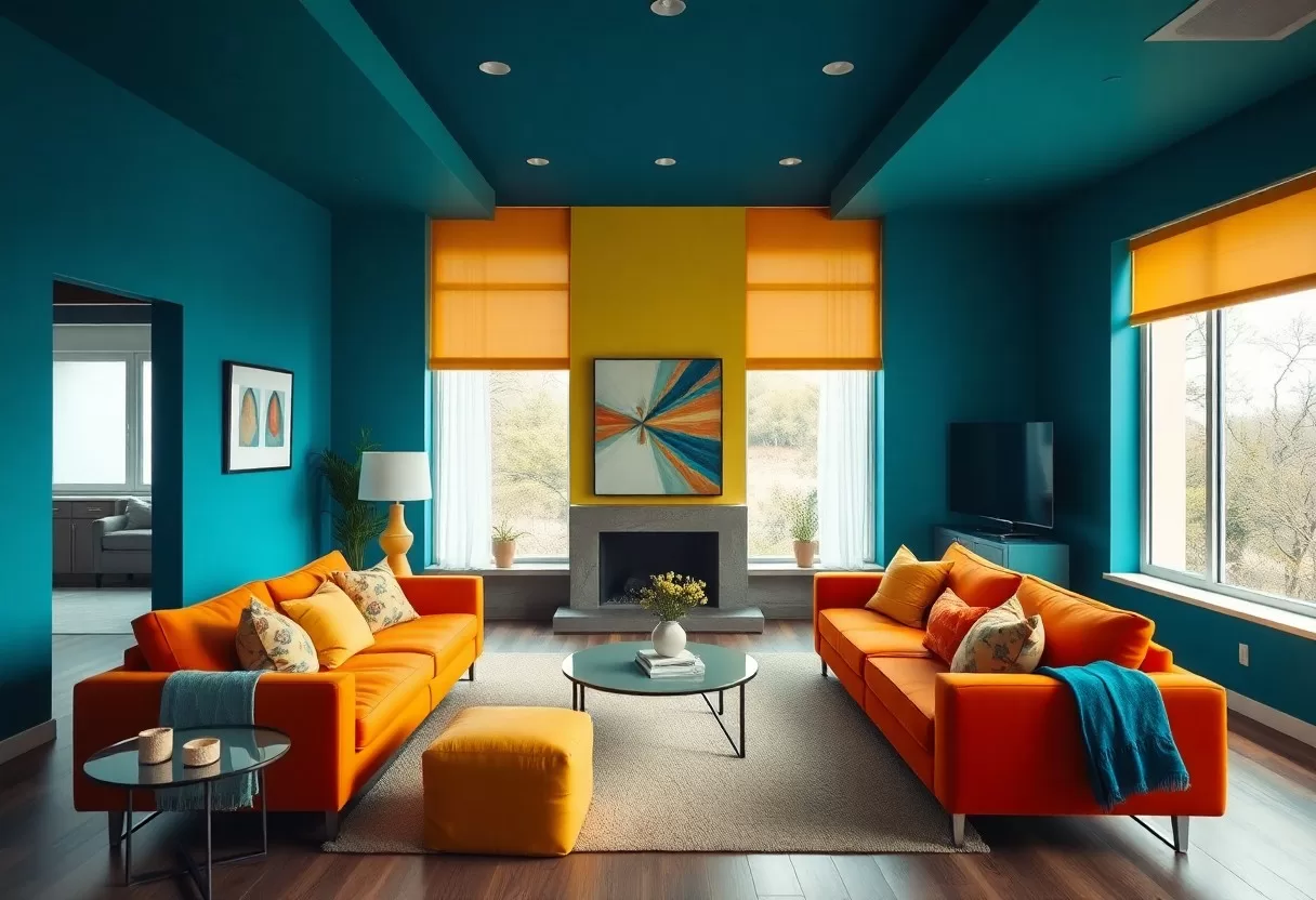
Using one deep tone across walls, ceiling and trim gives a room a sense of unity and purpose. A rich emerald green can make a library or den feel calm and luxurious, while coral or apricot brings energy to a kitchen or playroom. Gold frames, brass lamps and warm wood look especially good against dark backgrounds. White and pale furniture will stand out more, so place it where you want the eye to land.
Techniques for Effective Color Drenching
A drenched room takes some planning. Start by thinking about how a strong color will feel in that room, given what you use it for and when. Then decide how far to go: walls and trim only, or the ceiling, doors and built-ins too. Keep larger furniture, art and accessories in similar or complementary shades so the room feels whole rather than patchy.
Choosing the Right Color Palette
The color you pick sets the tone for the whole room. You can use a single shade everywhere for maximum drama, or try a tonal version: one color at slightly different strengths, such as a deeper shade on the walls and a lighter one on the ceiling. An analogous palette, using colors next to each other on the color wheel, gives a softer variation. Dark tones feel intimate, while light ones keep a room bright.
Before you commit, paint large samples, about 2 feet square, on two or three walls and on a piece of board you can hold up to the ceiling. Look at them in the morning, afternoon and at night with the lights on. Pay attention to undertones: a gray that looks neutral in the store can turn blue or green once it covers every surface. Pick the sample you still like after a few days.
Blending with Textures and Materials
Textures and materials keep a one-color room from looking flat. Mixing finishes is the easiest trick: matte walls, eggshell or satin trim and a semi-gloss on doors give the same color subtle variation as light hits each surface. Velvet and linen soften the look, while metal and wood add warmth and contrast.
Balance the color with materials that play off it. A green room with a natural wood floor gets contrast and warmth, and a deep blue room looks great with brass and walnut. Add soft textiles, such as throw pillows in the same color family or a rug in slightly darker or lighter tones, so the color has depth without overwhelming you. Aim for a layered look that invites touch, with a few pieces in a contrasting neutral to give the eye a rest.
Common Mistakes to Avoid
Color drenching is fun to try, but a few mistakes come up again and again. The first is picking a color that is too intense for every surface. The second is ignoring how light changes the color through the day. The third is forgetting about furniture and decor, which can make the room feel disconnected if they clash with the new shade. Plan for all three before you open the paint.
Overwhelming the Space
Going too bright on every surface can make a room feel overwhelming. Look for a comfortable balance that suits the room’s architecture and your furniture. A slightly muted or grayed version of a color is usually easier to live with than the pure, saturated shade. If you are nervous, drench the walls and trim but keep the ceiling a lighter tint of the same color, and bring in accents through art, pillows and plants.
Ignoring Lighting Conditions
Lighting has a big effect on how colors look. Natural light changes through the day, so the same paint can look bright at noon and murky at dusk. In the Northern Hemisphere, north-facing rooms get cooler, bluer light, which can make cool colors feel cold, so warm undertones often work better there. South-facing rooms get warmer light that suits most colors. At night, warm white bulbs around 2700 K keep deep colors rich instead of flat. Check samples under both natural and artificial light.
Case Studies in Color Drenching
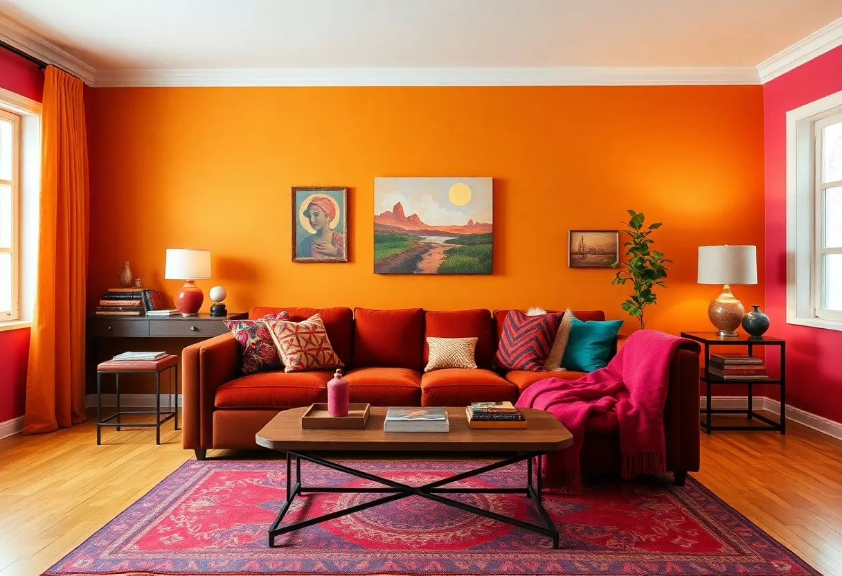
Real-world uses show how flexible this technique is. It works in homes and businesses, in tiny rooms and large ones. Here are a few common ways people use it, with the kind of color that tends to suit each.
- Small home office: a deep teal on every surface makes a compact room feel focused and cozy.
- Restaurant dining room: a warm mustard yellow creates a welcoming, lively mood for evening meals.
- Shared workspace: a soft green helps a busy office feel calmer and more restful.
- Small boutique: a bold fuchsia gives a shop a memorable look that customers recognize right away.
Residential Applications
At home, painting a room in one color is an easy way to add character. Powder rooms, mudrooms, home offices and guest bedrooms are great places to start, because they are small and you can repaint them in a weekend. A single shade across walls, ceiling and trim makes these spaces feel finished and intentional. Many people find a drenched room quickly becomes their favorite spot in the house.
Work from the top down: ceiling first, then walls, then trim and doors. Buy all the paint at once, and mix the cans together in a larger bucket so the color stays consistent from wall to wall. Deep colors often need a gray-tinted primer and two coats for even coverage. Keep a small jar of leftover paint for touch-ups later.
Commercial Spaces
Businesses use the same idea to build a memorable brand. A café, shop or office painted in one strong color is easy to remember and photographs well, which helps on social media. Bold color in entryways and waiting areas sets the mood the moment people walk in. Pick a shade that ties to your brand and works with your lighting, and test it on a small area before painting everything.
In offices, color can shape how a space feels to work in. Soft greens and blues tend to feel calm, while warmer tones can make meeting rooms feel more energetic. In retail, a strong color behind displays helps products stand out and makes the store easier to recognize. Keep practical needs in mind, though: very dark colors in a workspace call for more lighting, and high-traffic walls need a scrubbable finish.
Expert Tips for Implementation
To pull off color drenching, start with one shade that suits the room and the way you use it. Think about how lighting will change it through the day, and test samples on several surfaces. Layer textures and patterns for depth, but keep them in related tones. Try a few accessories in the color before you commit to paint. For more inspiration, browse this guide: Color Drenching: Bold Interior Design Trend …. Careful planning makes the painting itself the easy part.
Collaborating with Interior Designers
An interior designer can take your color drenching project further. Designers understand color theory and how light behaves in a room, so they can steer you toward a shade that suits your space and away from common mistakes. Many offer one-time color consultations, which cost much less than a full design project. Bring photos of rooms you love and be clear about the mood you want.
DIY Approaches
You can also do it yourself. Gather paint, good brushes and rollers, drop cloths and painter’s tape. Test colors on small areas before you go all in. Measure the room so you buy enough paint; a gallon usually covers about 350 to 400 square feet per coat, and a deep color will need two coats. Remember to include the ceiling and trim in your total.
Good preparation makes the finish last. Wash walls to remove dust and grease, fill holes, lightly sand glossy trim and prime so the paint sticks well. Lay drop cloths over the floor and use painter’s tape for crisp edges. Because every surface is the same color, small slips where walls meet trim or ceiling are easier to hide than usual. Let each coat dry fully before the next, and ask a friend to help with the ceiling.
Final Words
Color drenching is a simple way to give a room a strong, personal look. By wrapping walls, ceiling and trim in one rich hue, you get a space that feels unified and confident. It breaks away from the usual white-ceiling formula and works in almost any room. Start small, test your samples in real light, and pick a color you love. Then enjoy a room that feels like yours.
Q: What is color drenching in interior design?
A: Color drenching means painting the walls, trim, doors and often the ceiling (and sometimes furniture) in one color or close tones of it, so the room reads as a single, immersive whole.
Q: How can I choose the right color for a color drenching project?
A: For a color drenching project, think about the room’s size, how much daylight it gets and the mood you want: deep greens or inky blues feel cozy and enveloping, while lighter shades feel airy. Always test large samples on several walls and check them in morning and evening light before you commit.
Q: Are there any design tips for incorporating color drenching effectively?
A: To make color drenching work, add texture through fabrics, rugs and art, and use slightly lighter or darker shades of the main color for interest. Vary the sheen between walls and trim, and plan warm, layered lighting so the color looks rich after dark.
Test a color-drenched room on your own photo with the free AI interior design generator.
Paint calculator
Find out how much paint you need for a room, minus doors and windows.
Frequently Asked Questions
What is color drenching in interior design?
Color drenching is painting every surface of a room, walls, trim, doors, radiators and often the ceiling, in the same color or in tones of one color. It removes visual breaks and makes the room feel enveloping and intentional.
Does color drenching make a room look smaller?
Not necessarily. Because edges and corners blur, many small rooms actually feel larger and calmer. Light colors open a space, while deep colors create a cozy, cocooning effect without making it feel cramped.
What paint finish should I use for color drenching?
Use a matte or eggshell finish on walls and ceiling and a more durable satin on trim and doors. The slight change in sheen adds depth while keeping one color throughout.
Related Guides
