
Color Psychology at Home – Shades That Influence Daily Mood
Color psychology explains why some rooms feel calming and others energizing. Blues and greens tend to feel relaxing, warm tones feel social and lively, and neutrals create a backdrop for both. Here is how to use color psychology at home to choose the right palette for each room, and how to test colors before you commit.
Table of Contents
Key Takeaways: Color Psychology at Home
- Warm colors like red and orange feel energetic, while cool blues and greens feel calm.
- Neutrals such as beige and gray create a flexible base for accent colors.
- Lighting changes how colors look, so always test paint in your own light.
The Spectrum of Emotion: Colors and Their Psychological Effects
The colors around you affect how a room feels, even when you don’t notice them. Different shades can make you feel more alert, more relaxed or more social. Reactions vary from person to person, but some patterns are widely shared: warm tones feel lively, cool tones feel restful, and soft neutrals feel easy to live with. Thinking about these effects turns color from pure decoration into a tool you can use in every room.
Warm Colors: Energizing the Space
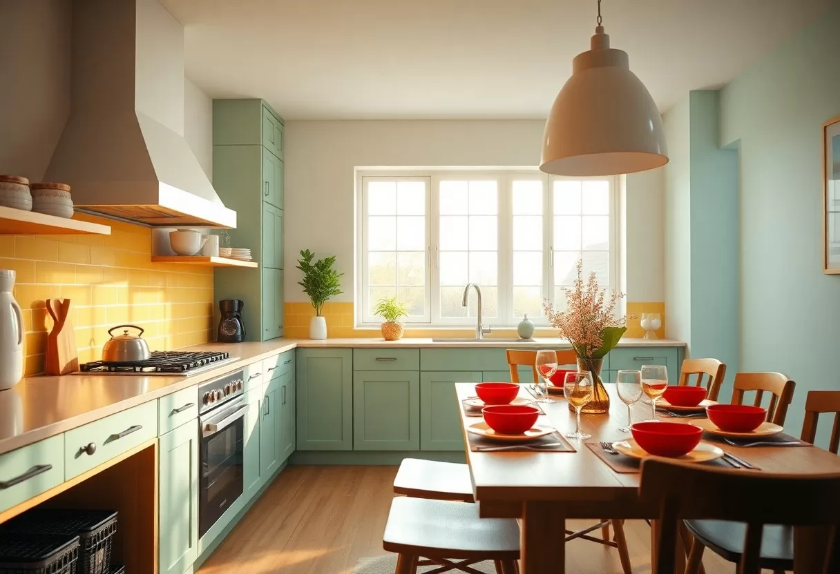
Warm colors, such as reds, oranges and yellows, tend to energize and stimulate a space. They feel cozy and active, and many people find they make a room more social. That makes them a good fit for dining rooms, family rooms and entryways. Use them with care in small rooms or bedrooms, since a strong red or orange on every wall can feel intense. Muted versions like terracotta, rust and mustard are easier to live with than pure, bright shades.
Cool Colors: Creating Calm and Serenity
Cool colors, including blues, greens and purples, are linked with calmness and tranquility, so they suit bedrooms and bathrooms. Many people find these shades restful after a busy day. Keep in mind that cool colors can feel chilly in a north-facing room with little sun. In that case, choose blues and greens with a little warmth in them, such as gray-greens, teal or a blue with a hint of green.
Cool colors also remind us of nature: water, sky and leaves. Blue is often associated with trust and peace, and green with growth and balance. Soft blues and muted greens work well in rooms meant for rest, reading or yoga. A touch of lavender in a bedroom or bathroom can feel soothing, especially with white linens and natural wood. Houseplants are an easy way to add living green to any room.
The Science Behind Color Choice in Interior Design
The science of color in interior design comes down to three things: hue (the color itself), value (how light or dark it is) and saturation (how intense it is). Value and intensity often matter as much as the hue. A pale, grayed blue feels very different from a bright electric blue, even though both are blue. When you choose colors with all three in mind, it’s much easier to create a room that feels calm, lively or focused.
Psychological Theories Underpinning Color Perception
How you react to a color depends on more than the color itself. Our eyes judge colors in context, so the same shade can look warmer or cooler depending on what sits next to it, an effect designers call simultaneous contrast. Personal memories and cultural meanings also shape how a color feels. A shade linked to a happy place may feel comforting to you, while someone else finds it dull.
Research Findings on Color and Mood
Research on color and mood exists, but it is less clear-cut than many articles suggest. Results vary between studies, and a lot depends on the exact shade, the person and the setting. Still, many people report similar general reactions: soft blues and greens feel calm, and bright yellows and oranges feel cheerful and energetic. Use these patterns as a starting point, not a rule.
The most reliable test is your own reaction. Paint large samples, at least 2 by 2 feet, or use peel-and-stick sample sheets, and place them on different walls. Look at them in the morning, in the afternoon and at night under your own lamps for a few days. Notice how you feel when you walk into the room. Bedrooms usually benefit from softer, cooler or muted shades, and workspaces can handle a bit more energy, but your own response is what counts.
Practical Palette Decisions: Choosing Colors for Common Spaces
When you choose colors for the main living spaces, think about what happens in each room. Living rooms, kitchens and dining areas are the backdrop for daily life, so the palette should support how you use them. A room for relaxing needs a different mood than a room for cooking or working. Balance looks with how the colors make you feel, and remember that open-plan spaces read as one area, so connect their colors.
Living Room Blues: Setting the Right Atmosphere
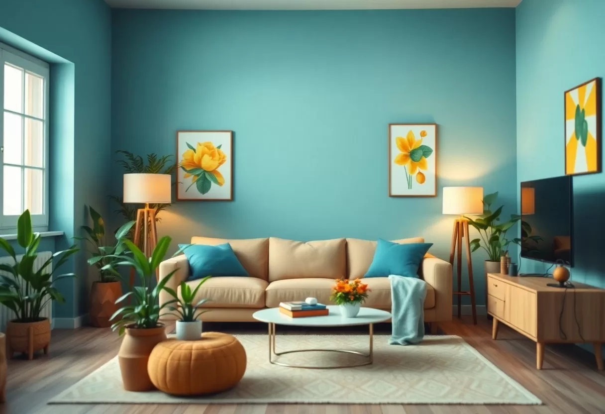
Your living room is for both relaxing and spending time with others. Shades of blue can make it feel calm without being cold. Soft blues create a soothing backdrop, while deeper navy or blue-green feels cozy, especially in the evening. Balance blue with warm materials such as wood, leather and woven textiles, plus warm-white bulbs around 2700 K, so the room feels inviting rather than icy.
Kitchen Yellows: Stimulating Creativity and Appetite
Yellow is cheerful and bright, which makes it popular in kitchens, where you start the day and cook for family and friends. Many people find it lifts their mood and makes a room feel sunny, even on gray days. Choose softer yellows such as butter, cream or pale ochre for walls, because very bright lemon shades can feel overwhelming and glare in strong light.
If you’re unsure about yellow walls, start with smaller doses: a painted island, open shelves, a backsplash, chair cushions or a bowl of lemons on the counter. Yellow pairs well with white cabinets, natural wood, navy and soft gray. Kitchen lighting matters too, since very cool LEDs can make yellow look greenish. Pick bulbs around 3000 K to keep it warm and appetizing, and bring a sample home before you commit to a full wall.
Personalization Through Color: Tailoring Your Environment
Your home should reflect who you are, and color is one of the easiest ways to show it. Choose colors that suit your personality and how you want to feel in each room, not just what is trending. A sunny yellow can liven up a home office, while calm blues suit a bedroom. When a room’s colors feel right to you, you’ll spend more time there and feel more at home.
Individual Preferences and Cultural Influences
Reactions to color depend on individual preferences and cultural background. In many Western cultures, red means love and passion, while in China it is linked with luck and celebration. White suggests weddings and purity in the West but is associated with mourning in parts of East Asia. Think about what colors mean to you and your household so the palette feels right to everyone who lives there.
The Importance of Personal Reflection in Color Selection
Choosing colors works best when you take a moment to reflect. Think about places where you’ve felt happy, calm or focused, and what colors surrounded you. Maybe a bright orange reminds you of summer vacations, or soft green brings back a favorite garden. Those memories are often a better guide than any trend report, and they help you choose colors that fit your lifestyle.
Collect what you’re drawn to. Save photos of rooms you love, and look at your closet, favorite artwork and the objects you keep on display; you’ll often spot a pattern. Gather paint chips and fabric swatches and group them into a few palettes. If pastel colors comforted you as a child, you might use soft versions of them in a bedroom or reading corner. This simple exercise makes it easier to create rooms that feel authentic and uplifting.
Balancing Color Schemes: Harmony and Contrasts for Mood Maintenance
Balancing harmony and contrast keeps a room comfortable to be in. Too many similar colors can feel flat, and too many strong contrasts can feel restless. A common rule of thumb is 60-30-10: about 60 percent main color, 30 percent secondary color and 10 percent accent. Combine soft background hues with bolder accents, and adjust the mix to each room’s purpose.
Complementary Colors: Creating Visual Appeal
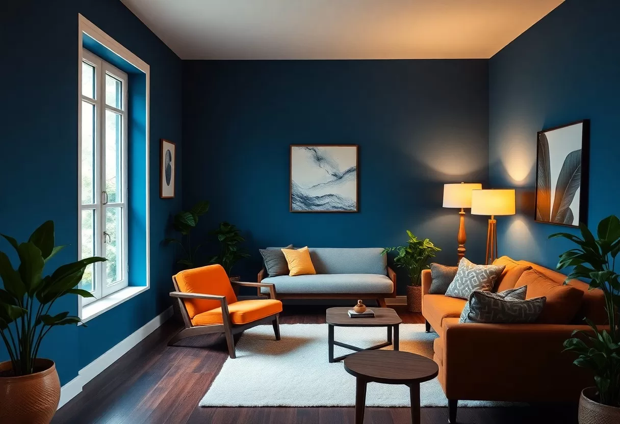
Complementary colors sit opposite each other on the color wheel, such as blue and orange, red and green or purple and yellow. Together they create lively contrast. A navy sofa with rust or burnt orange pillows is a classic example. Use these pairs in accessories and artwork rather than on every wall, so the room feels energetic without overwhelming your senses.
The Role of Neutral Shades in Enhancing Mood
Neutral shades are the quiet backbone of most rooms, letting other colors stand out. Beige, gray, greige and soft white anchor bolder hues and keep the palette balanced. They also make future changes easy, since you can swap pillows, art or rugs without repainting. Pay attention to undertones: a gray with blue in it feels cool, while one with a touch of yellow or red feels warmer.
Many people find neutral rooms restful, which is why they’re popular in bedrooms and reading nooks. To keep neutrals from feeling bland, add plenty of texture: linen, wool, wood grain, stone and woven baskets. Layer several shades of the same neutral, from light to deep, for depth. A green plant or a single colorful artwork can then add life without disturbing the calm.
Summing up
Now that you’ve seen how color psychology at home works, think about how you want to feel in each room and choose shades to match. Use soft blues and greens where you rest, warmer tones where you gather and neutrals to tie it all together. Test samples in your own light before you paint, and trust your reactions. A few thoughtful color choices can make your home feel calmer, livelier or more focused, right where you need it.
60-30-10 color palette generator
Pick a color you love and get a balanced room palette using the designers’ 60-30-10 rule.
FAQ
Q: How does the color blue affect mood in a home environment?
A: Many people associate blue with calm and find it restful, which is why it is a popular choice for bedrooms and quiet corners. Soft, light blues tend to feel airy and peaceful, while deep navy feels grounded and serious. Reactions vary from person to person, so choose a shade you personally find relaxing.
Q: What impact does the color yellow have in living spaces?
A: Yellow is widely associated with sunshine, warmth and cheerfulness. Used in moderation, it brightens a space and suits kitchens, breakfast nooks or family rooms. Very bright yellow over large areas can feel overwhelming to some people, so softer or buttery shades are easier to live with.
Q: Why should I consider using earthy tones in my home decor?
A: Earthy tones, such as browns, olive and sage greens, and warm beiges, feel grounded and remind many people of natural materials and the outdoors. They are easy to pair with wood, stone and plants and make a room feel cozy and inviting, which works well in living and dining areas.
Try different palettes on your room photo with the free AI interior design generator.
Related Guides
