
Brighten Your Home With The Butter Yellow Color Trend – Tips And Ideas
Brighten your space with the butter yellow color trend, a soft, warm shade that makes rooms feel cheerful without shouting. You can bring it into your home through walls, furniture, textiles or small accessories. Thanks to its easy adaptability, it suits many styles, from farmhouse to modern. Below you’ll find expert tips and practical ideas for using butter yellow decor well, including color pairings, paint advice and room-by-room suggestions.
Table of Contents
Key Takeaways: Butter Yellow Decor
- Butter yellow adds warmth and a cheerful vibe to any room, making it a versatile choice for both classic and modern interiors.
- Incorporate butter yellow through accent walls, textiles, or decorative accessories to create a balanced and inviting atmosphere.
- Pair butter yellow with soft grays, warm whites or pastels for a balanced, stylish look.
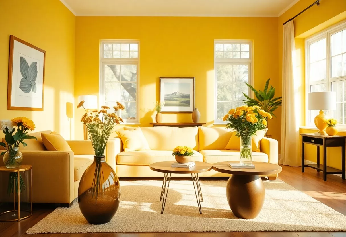
The Allure of Butter Yellow: Why It’s a Buzzing Trend
Butter yellow is a pale, creamy yellow with a little warmth in it, closer to fresh butter than to lemon. That softness is why it is so popular right now. It reads as cheerful but calm, and it sits comfortably in many design styles, from modern minimalist to cozy farmhouse. It works as a backdrop for both bold accents and neutral palettes, so you can use it in a big way on walls or in small doses on pillows and vases.
Psychological Effects of Butter Yellow
Colors can influence how a room feels, and yellow is linked with warmth, sunshine and optimism. A soft butter tone gives you that lift without the glare of a bright primary yellow, which can feel tiring on large surfaces. That makes it a good fit for kitchens, breakfast nooks and entryways, where a cheerful first impression helps. In rooms with little daylight, it can also make the space feel brighter and warmer than plain white.
Historical Context and Its Resurgence
Butter yellow has a long history in home design. It was a favorite in 1950s kitchens and turns up often in mid-century interiors, alongside mint green and pastel pink. Part of its return today comes from nostalgia and the comfort of familiar colors. After years of gray and stark white rooms, many designers have turned to warmer shades, and soft yellows are showing up again in paint collections, kitchen cabinetry and furniture.
In the postwar years, pastel kitchens and bathrooms were a cheerful break from darker, heavier interiors, and that sense of optimism still clings to the color. Its comeback fits a broader shift toward homes that feel relaxed and lived in. If you are nervous about committing, remember that soft yellow has cycled in and out of fashion for decades. A pale, muted version tends to age far better than a saturated one.
Perfect Pairings: Colors That Complement Butter Yellow
What you pair with butter yellow decides whether the room feels calm or lively. For a quiet look, surround it with neutrals. For more energy, add one or two deeper colors as accents. Deep greens, soft grays and crisp whites are safe starting points, since they keep the warmth of the yellow without competing with it. A simple guide is the 60-30-10 rule: about 60% main color, 30% secondary color and 10% accent.
Neutral Choices for Balance
Neutral shades like soft gray, beige or cream give butter yellow a calm backdrop. They ground the room and let the yellow stand out without overwhelming it. A light gray sofa with butter yellow throw pillows is an easy, classic combination. Pay attention to undertones. Warm beiges and creams look natural next to yellow, while very cool blue-grays can make it look slightly green. Test fabric and paint swatches side by side before you buy.
Bold Accents for Vibrancy
If you want a bolder look, pair butter yellow with stronger colors. Navy, cobalt, burnt orange and plum all create clear contrast against its softness. Introduce these accents through artwork, cushions or one statement piece of furniture rather than on every surface. Plum is especially striking, since purple sits opposite yellow on the color wheel. Navy is the easiest choice, because it acts almost like a dark neutral.
Bold accents give a room more movement. A deep navy sofa against butter yellow walls makes a striking pairing, and burnt orange curtains add extra warmth. Keep the yellow as the main color and let the bolder shades play supporting roles, so the room doesn’t feel chaotic. Repeat each accent color two or three times around the room, such as in a pillow, a print and a vase, so it looks planned rather than accidental.

Mood Enhancement: Transforming Spaces with Butter Yellow
Butter yellow can lift the mood of a room in a way few colors can. It feels warm and welcoming, and on a gray winter day it brings a bit of sunshine indoors. Light matters, though. In a north-facing room, the cool daylight can mute yellow, so choose a version with a little more warmth. In a sunny south-facing room, a paler, softer shade keeps the walls from glowing too strongly in the afternoon.
Living Room Inspirations
In a living room, butter yellow makes a friendly backdrop for gatherings. Try an accent wall, a few throw pillows or an area rug with yellow in the pattern. Pair it with deep navy or soft gray for a polished contrast, or mix prints for a more eclectic feel. Smaller pieces like artwork, vases or a lampshade also add touches of color that you can easily swap out later if you change your mind.
Cozy Bedroom Ideas
Butter yellow also works well in a bedroom when you keep it soft. Use it on bedding, curtains or a feature wall behind the headboard. A butter yellow quilt looks lovely against muted tones, and warm-white bulbs around 2700 K bring out the color in the evening. Avoid a very saturated yellow on all four walls of a bedroom, since it can feel too stimulating. A pale, creamy shade keeps the room restful.
For a relaxed bedroom look, pair butter yellow with soft whites and gentle earth tones like sand, oatmeal and terracotta. Layer textures such as a knitted throw, linen sheets and a wool rug for comfort. A butter yellow accent chair in a corner, with a small side table and a floor lamp, makes an inviting reading spot. Finish with a few framed prints that pick up the yellow, so the color appears in more than one place.
Practical Application: Incorporating Butter Yellow into Your Decor
Bringing butter yellow decor into your home can be as small or as big a project as you like. You can use it on walls, furniture or accents. For a quick start, paint one accent wall or add butter yellow pillows to your sofa. Then build out from there with complementary colors such as navy, gray or earthy tones. Start small, live with it for a few weeks, and add more once you know you like it.
Paint Techniques and Wall Options
Paint finish changes the look of butter yellow. A matte or eggshell finish gives walls a soft, cozy look and hides small flaws. Satin or semi-gloss is better for trim, doors and kitchen cabinets, since it is easier to wipe clean. For something different, try a striped feature wall or a two-tone wall, with a darker color on the lower third and butter yellow above. Always paint a large sample, at least two feet square, and check it at different times of day.
Textiles and Accessories for a Finishing Touch
Textiles and accessories are the easiest way to try butter yellow. Curtains, rugs and throws in this shade brighten a room right away. Mix textures, from fluffy cushions to smooth table runners, to add interest and draw the eye to the color. Because textiles are easy to change, they are a low-risk way to test the trend before you pick up a paintbrush.
When you choose textiles, mix solid butter yellow fabrics, like linen curtains or knitted blankets, with prints that repeat the same shade. Floral or geometric patterns can add a modern twist while keeping the look consistent. Smaller accessories, like vases, picture frames or artwork, are easy to swap out each season. This lets you refresh your decor without a full makeover, and you can turn the yellow up or down as your taste changes.
Sustainability in Style: Sourcing Eco-Friendly Butter Yellow Decor
Choosing butter yellow decor is also a chance to shop more sustainably. Look for pieces made from natural or recycled materials, buy secondhand, or upcycle what you already own. Ask sellers about materials and finishes, and choose low-VOC paints for walls and furniture. For more ideas, you can explore the Butter Yellow Is the Soft Shade Your Home Needs article for inspiration on creating a warm, inviting space while shopping responsibly.
Ethical Brands to Consider
When you buy new, look for pieces whose sustainability claims are easy to verify. Check for low-VOC or zero-VOC paint, FSC-certified wood, recycled materials and natural fibers like cotton, linen and wool. Third-party certifications tell you more than vague words like “green” or “eco.” Smaller local makers and vintage shops are also good sources for one-of-a-kind butter yellow pieces with a smaller footprint.
DIY Projects with Recycled Materials
DIY projects are a fun, low-cost way to add butter yellow décor sustainably. Repainting or reupholstering old furniture gives you a unique piece and keeps it out of the landfill. A plain wooden chair, side table or dresser painted butter yellow can become the focal point of a room. Painted furniture works best on solid wood, which takes sanding and primer well and holds up to everyday use.
Start by finding secondhand furniture at thrift stores, yard sales or even in your own garage. Clean the piece, sand it lightly, apply a primer and then two thin coats of low-VOC paint in a soft butter yellow. Finish with a clear water-based topcoat on tables and dressers that get heavy use. You can also make wall hangings from fabric scraps or reclaimed wood. Each project keeps your style fresh while reusing what already exists.
Summing up
With these tips, you can use the butter yellow color trend to make your home brighter and more welcoming. Bring it in through paint, furniture or accents, and pair it with neutrals for calm or deeper colors for contrast. Use it in small doses or as a main feature, and experiment with textures and patterns that suit your style. Start with one room, see how it feels, and build from there.
Try butter yellow on your walls with the free AI interior design generator.
60-30-10 color palette generator
Pick a color you love and get a balanced room palette using the designers’ 60-30-10 rule.
Frequently Asked Questions
What colors go with butter yellow?
Warm whites, soft greens, sky blue, terracotta, natural wood and brass pair well. For contrast, try navy or charcoal accents.
Where does butter yellow work best?
Kitchens, breakfast nooks, entryways and north-facing rooms that need warmth. Use it on walls, cabinets or textiles depending on how bold you want to go.