
The Color Palette Everyone Is Using Right Now
Interior color palette trends shift every year, shaped by culture, fashion and how we want to feel at home. Recent palettes favor warm browns, earthy greens, rich reds and soft butter yellows over the cool grays that ruled for a decade. Here are the leading colors, why they caught on and how to use them without repainting your whole house every season.
Key Takeaways: Interior Color Palette Trends
- Interior color palette trends favor warm, earthy tones.
- Browns, greens, rich reds and soft yellow are replacing cool grays.
- Use trends on easy-to-change elements first.
Table of Contents
The Leading Colors of the Moment: A Bold Transition
Right now, color is moving in two directions at once, as yearly trend reports such as Pinterest’s trending palette show. One side is bright and electric; the other is calm and drawn from nature. The most interesting rooms combine the two, a bold blend of energy and rest, with a calm base and a few punchy accents.
The Rise of Electric Hues
Electric hues bring excitement into a room. Bright pinks, bold yellows and electric blues show up in fashion and interiors alike, for people who want more energy at home. Used well, these colors bring out creativity and personality. The trick is scale: a saturated color on a large wall can feel tiring, so try it first on a door, a lampshade, a cushion or the back of a bookcase, where you can enjoy it without being overwhelmed.
Nature-Inspired Tones as Counterbalance
Nature-inspired tones balance the bright colors. Soft greens, earthy browns and calm blues reflect a growing interest in sustainability and the outdoors. Many people find these grounding shades restful, which makes them a natural choice for bedrooms, living rooms and home offices where you want to slow down.
Using nature-inspired tones as a base gives a room stability, so brighter accents have something to play against. Sage and olive greens feel fresh, while browns, from caramel to chocolate, add warmth. A useful rule of thumb is 60-30-10: about 60 percent of the room in a main color, usually the walls, 30 percent in a secondary color for furniture or textiles, and 10 percent in an accent. A sage room with walnut furniture and a few cherry-red cushions is an easy example. The result looks bold but still calm.
Cultural Influences Shaping Color Trends
Culture shapes color more than most of us notice. Art movements, fashion cycles and wider social changes all influence which shades feel fresh. Social media and digital art, for example, have made vivid, experimental color more familiar, so many people now feel freer to choose colors that reflect their own identity rather than playing it safe with beige.
The Impact of Global Events on Color Perception
Big events change how people feel about color, too. During the pandemic, many people spent far more time at home and looked for comforting, calming shades. Growing attention to climate and nature has also pushed interest toward earthy tones and natural palettes. Both shifts help explain why warm, soft colors replaced cool grays in so many homes.
Shifts in Consumer Behavior and Preferences
Sustainability also shapes what people choose. Natural materials like wood, clay, linen and wool come in earthy colors, and they pair easily with paint in similar tones. If eco-friendly living matters to you, look for low-VOC or zero-VOC paints, which release fewer fumes, and choose colors you will be happy with for years rather than months. Soft greens and warm earth tones suit that long-term approach well.
Younger buyers, especially millennials and Gen Z, often say they care about sustainability, and many brands have responded with more organic, earthy colors in their collections. You will see this in furniture, textiles, tiles and paint. For your home, the takeaway is simple: choose colors that mean something to you and that work with your materials and light, not just what is popular this year. That keeps a palette from feeling dated quickly.
The Psychology Behind Color Choices
Color psychology explains why certain hues feel the way they do. Colors can affect mood and shape how we see a space, which is why designers and marketers think about them carefully. Warm tones like red and orange tend to feel energetic and lively, while cooler shades like blue and green often feel calm and steady. Responses vary by person and culture, so treat these as general guides, not rules.
Emotional Resonance of Trending Colors
Trending colors often mirror the general mood. Lately that means soft, optimistic yellows and calm ocean blues, which many people find cheerful and restful. Yellow works well in kitchens and entryways, where it feels welcoming; blue suits bedrooms and bathrooms. In a north-facing room, which gets cooler light, pick yellows and blues with a warm undertone so the room does not feel cold.
Color Associations and Brand Identity
Color associations matter for brands and for homes. Green is commonly linked with nature and health, while black often suggests sophistication and luxury. If you run a business, choose colors that fit the message you want to send. At home, the same idea applies: decide how you want a room to feel before you pick a paint chip.
Many brands use green to signal freshness or a link to nature, and many luxury labels lean on black for a sense of exclusivity. Using the same colors consistently helps people recognize a brand and remember it. At home, consistency helps too. Repeating two or three key colors from room to room makes a house feel connected, even when each room has its own accent.
Predictions from Industry Experts
Many designers expect palettes to keep drawing from nature, with colors that support a sense of well-being. Lush greens, calm blues and warm yellows are likely to stay popular, offering a mix of optimism and calm in everyday spaces. Paint companies publish their own color forecasts each year, and comparing a few is a good way to see which shades keep showing up.
Insights from Leading Designers and Color Strategists
Designers also point to a strong link between color and earth-friendly choices. Expect more hues drawn from natural elements, like clay, moss, stone and sand, used for walls, upholstery and even kitchen cabinets. These shades connect a home with its surroundings and age gracefully, which is why they show up in everything from decor to product packaging.
Emerging Color Trends in Technology and Fashion
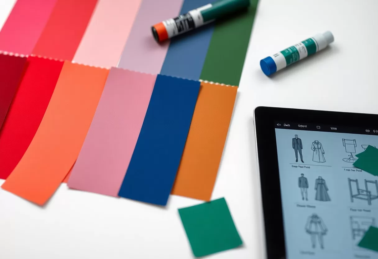
Technology and fashion are also shaping color. Phones, headphones and clothing often use bold, experimental hues that appeal to younger buyers. Neon accents paired with soft pastels reflect both a digital-first mindset and a wish for comfort. Interiors often pick up these colors a season or two later, usually in small objects, lighting and textiles.
Social media spreads these colors quickly. Bright purples and electric greens, often seen in digital art and games, now turn up in gadgets and on runways, and brands sometimes release limited-edition products in them. At home, these strong shades work best in small doses: a neon sign, a colored glass vase, an LED strip behind a shelf. That way you can enjoy the trend and change it easily.
Practical Applications of the Current Color Palette
The current palette gives you plenty of ways to refresh a space, from a living room to a shop front or a website. Thoughtful use of trending colors can make a room feel more energetic or more relaxed and shape how guests feel when they walk in. Start small, test colors in your own light, and build from there.
Incorporating Trending Colors into Interior Design
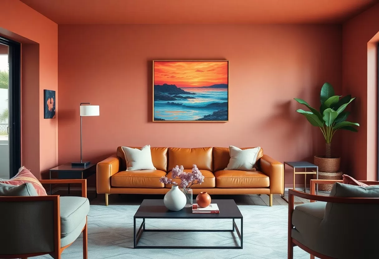
To bring current colors into your home, combine muted tones with a few bright accents. Deep teal or warm terracotta can become a focal point, while softer pastels make a calm backdrop. Layer the colors through textiles, furniture and wall finishes so the room feels connected. Before you paint, put up large samples, at least about 2 by 2 feet, on two walls and look at them in morning, afternoon and evening light, since color changes a lot through the day.
If you are wary of trends, apply them where change is cheap. Pillows, throws, rugs, lampshades and art are easy to swap. Paint is next, since one wall or a powder room takes a weekend. Save big commitments like kitchen cabinets, tile and sofas for colors you are sure you will love for many years. Following interior color palette trends this way keeps your home current without costly regrets.
Utilizing Colors in Marketing and Branding
For a business, the current palette can help a brand feel fresh. Choose colors that fit your themes and appeal to your audience while staying true to your values. Consistent use builds recognition and helps tell a story customers remember.
Color in marketing and branding goes beyond looks; it affects how people see a product and how they feel about it. Pairing soothing greens with energetic yellows, for example, suggests both calm and optimism. Test colors with real customers when you can, check that text has enough contrast to be easy to read, and use your palette the same way across packaging, signs and online. Steady use over time is what builds a lasting link between a color and your brand.
Summing up
Keeping up with color trends does not mean repainting every year. The current mood favors earthy, nature-inspired shades with a few bright accents and soft pastels. Muted, warm colors create a calm and welcoming home, while small doses of bold color keep it lively. Pick what you love, test it in your own light, and use trends as inspiration rather than rules.
Try trending palettes on a photo of your room with the free AI interior design generator.
60-30-10 color palette generator
Pick a color you love and get a balanced room palette using the designers’ 60-30-10 rule.
Frequently Asked Questions
What colors are trending in interiors?
Warm, earthy tones lead: chocolate and caramel browns, olive and sage greens, terracotta, deep reds and soft butter yellow. Cool grays and stark whites are less popular.
Should I follow color trends?
Use trends for elements that are easy to change, such as paint, pillows and accessories. For expensive items like sofas, cabinets and tiles, choose colors you will love for many years.
Related Guides
