The Art of Negative Space – Designing With What You Don’t Use
Negative space is the empty area around and between objects. In interior design, leaving space on walls, floors and surfaces makes rooms feel calmer, larger and more intentional. Here is the philosophy behind it and practical ways to use what you leave out.
Table of Contents
Key Takeaways: Negative Space in Design
- Negative space improves the overall composition and draws focus to the main subject.
- Using empty areas well creates balance in a design.
- Understanding negative space encourages creativity and leads to fresh visual solutions.

The Philosophy of Absence: Why Less is More
The idea of “less is more” pushes back against the urge to fill every surface. When you use fewer elements, the ones you keep get more attention, and the message or focal point comes through clearly. Thoughtful use of negative space in design is about removing what competes, not leaving things bare. In a room, that might mean one strong piece of art on a clear wall instead of a crowded gallery, so the eye has a place to land and rest.
A quick way to test this at home: take everything off a shelf, a console or a mantel, then add items back one at a time. Stop when the arrangement feels complete, not full. Groups of three objects in different heights often look more natural than pairs. The empty part of the shelf is doing work too, because it gives those few pieces a frame.
The Origins of Negative Space in Art and Design
Using empty space on purpose is an old idea. Traditional Chinese and Japanese ink painting often leaves large areas of the paper blank, so mist, water or sky is suggested rather than drawn. Japanese culture even has a word for this meaningful gap, ma. Western painters used plain backgrounds and quiet areas to frame their subjects too. In the twentieth century, the Minimalist movement turned simplicity and intention into a guiding rule for art, architecture and product design.
Psychological Impact of Void in Visual Perception
Empty areas change how you read a composition. Our eyes naturally separate a figure from its background, an idea Gestalt psychologists called figure-ground. The classic example is the vase that turns into two faces when you shift your focus. Because of this, negative space is a strong tool for directing attention. Depending on how you use it, generous empty space can feel calm and open, while a tight, off-balance gap can create tension.
A well-placed gap can also make people curious and invite them to look longer. Empty space pulls the eye toward the features that matter, so the main idea is not lost in clutter. Think of a hallway with a single bench and a mirror, or a living room where the sofa wall stays mostly bare. When you choose these pauses on purpose, you shape how people move through and experience the space you have created.
Harnessing Negative Space in Composition
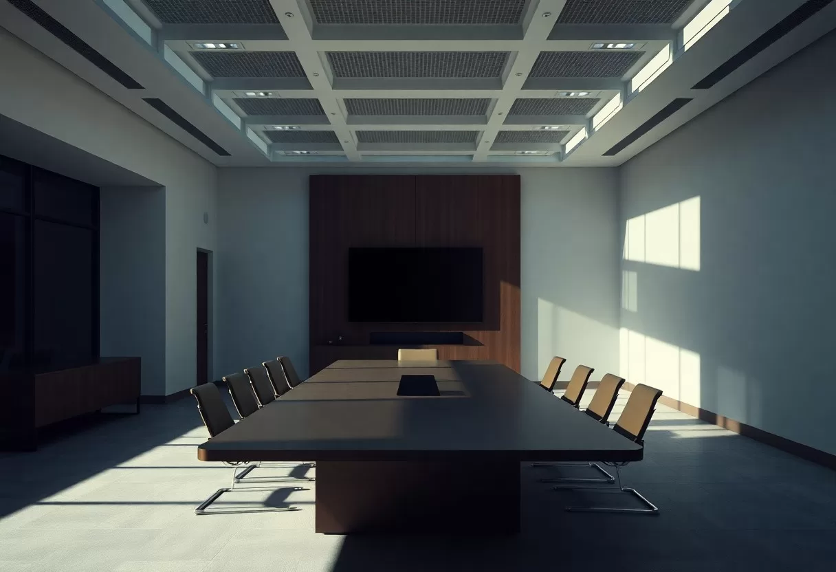
Good composition depends on deliberate negative space. It lets a design breathe and gives the focal point room to stand out. By placing elements carefully, you guide the viewer’s eye and create resting areas between busy zones. In a room, those resting areas are clear floor, open wall and uncluttered counters. Paying attention to what you leave out often improves a layout more than adding another piece.
The Balance of Elements: Creating Harmony
Balance comes from arranging visual elements and empty space so neither overwhelms the other. You can pair a heavy shape with a lighter one, or a strong color with a calm field, and let space sit between them. In interiors, symmetrical layouts feel formal and steady, while asymmetrical ones feel relaxed but still need a counterweight, such as a tall plant balancing a low console. Either way, the space between objects is what steers attention to the most important parts.
Layering Techniques: How to Integrate with Purpose
Layering adds depth, and negative space keeps it from turning into clutter. By stacking elements with different opacities, sizes or contrasts, you create a sense of dimension while still leaving clear areas around them. In a room, layers might be a rug, a sofa, a throw and a lamp behind it. The open areas around that group keep it readable and invite people to look closer.
To layer well, think about how each layer interacts with the others and with the empty space around it. In graphic design, a translucent overlay can soften bold imagery so text on top stays readable. Photographers do something similar by placing a subject against an out-of-focus background, which turns the background into a soft, quiet field. At home, the same rule applies: give each layer a job, and stop adding when a new layer no longer improves the whole.
Practical Applications: Transforming Negative Space into Strategic Design
Used with a plan, negative space lifts everyday design work. It draws attention to key elements, keeps the overall look balanced and helps a message come across quickly. From logos to posters to room layouts, a few thoughtful gaps can turn a busy, forgettable design into something people notice and remember.
Case Examples in Graphic Design and Branding
Some well-known logos show how clever negative space can be. The FedEx logo hides an arrow in the white space between the “E” and the “x,” a quiet hint at speed and direction. The WWF panda uses a few black shapes and lets the white background complete the animal’s outline. Both marks are simple, easy to recognize at any size and reward a second look, which is exactly what a strong logo needs.
Applying Negative Space in Typography and Layouts
In typography, negative space is what makes text easy to read. Adjusting the space between letters, words and lines guides the reader’s eye and keeps a page from feeling dense. Good layouts use margins and gaps to separate sections, so readers can scan and find what they need. A careful balance between text and empty space turns heavy information into content people actually finish reading.
Designers tune line height, letter spacing and kerning to improve readability. A comfortable line height for body text is usually around 1.4 to 1.6 times the font size, and lines of roughly 50 to 75 characters are easiest to follow. Generous margins around text blocks draw attention to the key content. Some designers, such as David Carson, became known for breaking the usual grid and using space in unexpected ways. Whether you follow the grid or break it, the spacing sets the rhythm of the page.
The Role of Negative Space in User Experience Design
Good user experience (UX) design leans heavily on negative space, which acts as a quiet guide. Empty areas around buttons, images and text make a screen easier to understand and reduce the effort needed to process it. Space also sets the visual hierarchy, so users can move through content without hunting for the next step.
Navigational Flow: Enhancing User Interactions
Clear navigation helps people move through a website or app with ease. Negative space removes distractions and makes the path to important functions obvious. Group related links together, leave clear space between unrelated groups, and give main buttons room on all sides. When the layout is simple, users explore more without feeling overwhelmed.
Creating Focused Experiences Through Minimalism
Minimalism creates focused experiences by stripping away anything that does not serve a purpose. With enough negative space, you can make the most important content and the main call to action stand out. This kind of clarity is a deliberate choice, and it makes the whole experience feel calmer and easier to use.
Cutting visual clutter changes how people use a platform. When key elements have space around them, they are easier to spot and act on, and users can take in information without rereading. A practical approach is to pick one primary action per screen, remove or tuck away secondary options, and test the page with a few real users. Less clutter usually means less frustration, which is why spacing is such a core part of modern interface design.

Breaking Conventional Boundaries: Negative Space in Diverse Mediums
Negative space works across many mediums, not just graphics and screens. In architecture and photography, empty space can shift the mood of a work and carry meaning through what is left out. Looking at how other fields handle space can give you fresh ideas for your own projects and change how you think about using space well.
Architectural Design: The Power of Air and Light
In architecture, negative space helps form and function work together. Air and light define rooms just as much as walls do, and they shape how people move and gather. Frank Lloyd Wright’s Guggenheim Museum in New York is a classic example: its open central rotunda, topped by a skylight, lets daylight fall through the spiral ramps and makes the building’s curves easy to read.
You can use the same thinking at home. Leave clear walkways about 36 inches wide through main rooms, keep roughly 18 inches between a sofa and a coffee table, and resist filling every corner. Let one wall stay mostly bare so a single piece of art or a window view can stand out. Hang art with its center around 57 to 60 inches from the floor, and leave a few inches between frames in a group so each piece has room.
Photography: Framing the Unseen
In photography, negative space changes how you see the subject. Leaving open areas around your main focal point guides the viewer’s eye and sets a mood. Many striking images use a plain background, such as sky, water or a blank wall, so the subject has room to breathe within its setting.
Picture a photo where the subject fills only a small part of the frame, surrounded by open sky or empty sand. Depending on the context, that space can feel lonely or peaceful. Many great street and landscape photographers have used this approach to make a small subject feel more important. To try it, place your subject on one of the rule-of-thirds lines, keep the background simple, and leave space in the direction the subject is facing or moving.
Final Words
Understanding negative space helps you create more balanced and effective designs. When you leave empty areas on purpose, your work becomes clearer and attention goes where you want it. That applies to a logo, a web page or your own living room. Practice editing as much as adding. Over time, your projects will feel more confident and easier to read, because the space around each element is doing part of the work.
Room size checker
Enter a room’s dimensions to see if it meets comfortable space-planning ranges.
FAQ
Q: What is negative space in design?
A: Negative space refers to the area around and between the subject of an image or design. It is the space that is not occupied by the main elements, allowing the viewer to focus on the important parts and creating balance in the composition.
Q: How can negative space improve a design?
A: Utilizing negative space can enhance a design by creating a sense of clarity, enabling better visual flow, and guiding the viewer’s eye. It can also help to emphasize key elements, making the overall design more impactful and aesthetically pleasing.
Q: What are some techniques for effectively using negative space?
A: Techniques for using negative space include simplifying shapes, using contrasting colors, and strategically positioning elements to create patterns or shapes from the spaces in between. Experimenting with different layouts can also reveal new ways to utilize negative space effectively.
Experiment with less furniture and more space in the free 3D room designer.
Related Guides
